You can invest in performance marketing, refine your onboarding flow, and optimize every CTA—yet still lose global users in the first 30 seconds. Why? Because the interface does not feel like it was built for them.
Research from CSA Research shows that 76% of consumers prefer to buy products with information in their own language, and 40% will not purchase at all if it is not available in their language.
And language alone is only half the equation.
A checkout button that expands beyond its container in German.
A date format that confuses users in the UAE.
A payment flow that breaks when switching to right-to-left.
For product teams expanding internationally, User Interface Localization is where strategy meets engineering. It sits at the intersection of string management, layout flexibility, locale-aware formatting, and QA discipline. When it is handled well, users move smoothly from discovery to activation. When it is rushed, friction multiplies quietly—until metrics start slipping.
In this guide, we will break down how to make your interface feel native. From string preparation and layout resilience to locale-specific formatting and final QA checks, you will walk away with a practical checklist your designers and developers can actually use.
User interface localization is the process of adapting a digital product’s visible interface, layout, microcopy, formats, directionality, and user experience patterns for a specific language and market. It goes beyond translation by ensuring buttons, forms, menus, error messages, dates, currencies, icons, and navigation flows feel natural to local users.
What Is User Interface Localization?
Before teams scale internationally, they often ask a deceptively simple question: “We’ve translated the app, so we’re localized, right?”
Not quite.
User interface localization is the process of shaping how the product behaves, reads, and visually adapts in every target market. It ensures that the interface feels designed for users in Tokyo, Berlin, São Paulo, or Dubai.
UI Localization: More Than Words on a Screen
At its core, User Interface Localization adapts:
- Language and tone to match user expectations and product voice
- Layouts and spacing to handle text expansion or contraction
- Regional conventions such as date formats, currencies, units, and address fields
- Directional logic for right-to-left languages like Arabic or Hebrew
- Cultural UX norms, including color symbolism, icon meaning, and hierarchy
Increase installs and retention with UX-aware App Localization Services tailored for iOS and Android.
UI Localization Workflow: From Strings to Release
Expanding a product into new markets rarely fails because of one catastrophic mistake. It fails quietly—through missed strings, broken layouts, inconsistent terminology, or updates that bypass localization entirely.
A sustainable UI localization process protects product experience while enabling speed. Below is the framework we implement with product, design, and engineering teams to ensure interfaces feel native across releases.
1. Preparation: Audit the Interface Before You Translate
Localization begins long before files move to linguists.
This stage focuses on visibility and clarity:
- Inventory every string: buttons, tooltips, error messages, onboarding steps, system notifications, emails triggered by UI actions
- Define tone and voice per market
- Build a terminology glossary aligned with product UX language
- Create a style guide covering punctuation, capitalization, and microcopy standards
2. Engineering: Structure the Product for Localization
Well-prepared content still fails if engineering foundations remain rigid.
Key technical steps include:
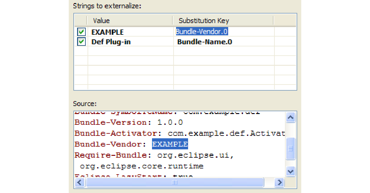
- Externalizing strings into structured resource files (JSON, XML, String Catalogs, etc.)
- Separating UI logic from text
- Protecting placeholders and variables (e.g., {username}, %d items)
- Designing layouts for text expansion (German can expand 30–35% compared to English)
- Supporting bidirectional text for right-to-left languages
Pseudo-localization at this stage helps teams stress-test layouts early. It artificially expands text and inserts special characters to simulate real-world conditions. Catching layout issues here prevents costly hotfixes post-launch.
Eliminate broken layouts and placeholder errors with expert Localization Engineering Services built for modern development workflows.
3. Translation: UX-Aware Linguistic Adaptation
Interface translation differs from document translation.
UI copy demands:
- Precision within strict character limits
- Alignment with user expectations
- Contextual clarity inside workflows
- Cultural adaptation for icons, commands, and calls to action
A button labeled “Continue” might require different phrasing depending on whether it advances onboarding, confirms payment, or saves preferences. Linguists must understand product context.
4. Quality Assurance: Functional and Visual Validation
QA validates both language and experience.
A robust review includes:
- Functional testing inside staging environments
- Visual review in context to check truncation, overlap, and alignment
- Format validation for currencies, dates, time zones, and numeric conventions
- Consistency checks across flows
- Pseudo-localization testing to surface layout vulnerabilities
Localization errors often surface only after integration. Reviewing strings inside spreadsheets provides limited visibility. In-context QA protects brand perception and user trust.
5. Release and Continuous Localization: Build for Ongoing Growth
Modern product teams operate in continuous deployment cycles. Without structured workflows, newly added strings bypass translation and create fragmented experiences.
Best practices include:
- Version-controlled localization files
- Integration with a Translation Management System (TMS)
- Automated QA checks
- Ongoing glossary updates
- Feedback loops between support, product, and localization teams
Convert global traffic into customers with strategic Website Localization Services.
Cultural UX Factors in User Interface Localization
Users evaluate tone, visual cues, and interaction patterns within seconds. When cultural expectations align with interface design, trust forms quickly. When they clash, hesitation follows.
Below are the core cultural layers product teams must address to ensure interfaces resonate locally.
1. Tone and Politeness Levels
Every language carries social hierarchy and expectation.
In English-language products, brevity often signals clarity:
“Save changes.”
“Try again.”
In Japanese, Korean, or German contexts, tone may require additional formality or respectful phrasing depending on the audience. In Arabic markets, warmth and hospitality often influence customer-facing messaging. In Nordic markets, direct and concise communication earns trust.
Tone also varies by industry. A fintech platform benefits from authority and reassurance. A lifestyle app may lean conversational. Cultural tone calibration ensures the product voice matches local user expectations rather than sounding mechanically translated.
2. Icon Meaning and Visual Semantics
Icons appear universal at first glance. In practice, many carry cultural assumptions.
- A mailbox icon may look foreign in countries where physical mailboxes differ.
- A hand gesture icon can carry unintended connotations.
- A floppy disk symbol for “Save” makes sense to some users and feels outdated to younger audiences globally.
Even navigation patterns vary. Some markets prefer dense information structures; others favor minimalist layouts. Cultural research supports the notion that the interpretation of symbols and imagery is heavily influenced by local context.
3. Color Symbolism
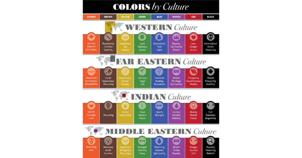
Color communicates instantly and emotionally.
- White symbolizes purity in Western markets, yet may represent mourning in parts of East Asia.
- Red conveys urgency or error in many Western interfaces, while in China it often represents prosperity and celebration.
- Green suggests success in some regions and may carry religious or political associations in others.
Brand guidelines must adapt thoughtfully across regions without diluting identity. Cultural color mapping strengthens visual trust and emotional alignment.
4. Cultural Relevance in Micro-Interactions
Small UI moments carry weight:
- Date formats (MM/DD/YYYY vs DD/MM/YYYY)
- Address field structure
- Name order conventions
- Payment preferences
- Formal vs informal pronouns
5. Cultural Context Within Content Hierarchy
What receives prominence in one market may hold secondary importance in another.
For example:
- Privacy disclosures carry heightened attention in EU markets under GDPR norms.
- Payment trust badges play a significant role in emerging digital economies.
- Community features resonate strongly in collectivist cultures.
UI Localization QA Checklist Before Launch
Global launches rarely collapse because of one dramatic error. They stumble over small oversights: a truncated button in German, a misplaced placeholder in Arabic, a date format that shifts meaning between markets.
Below is a practical, skimmable checklist product, design, and localization teams can use before shipping any localized release.
Pre-Release UI Localization QA Checklist
- All strings extracted and context provided
Confirm that every UI element—buttons, tooltips, modals, error messages, onboarding prompts—has been externalized. Provide translators with screenshots, character limits, and functional notes. Context reduces ambiguity and improves translation quality dramatically.
- Variables and placeholders protected
Verify that dynamic elements ({username}, %s, %d) remain intact. Ensure placeholder order supports languages that require grammatical reordering. Run automated checks to catch formatting breaks.
- Dates, times, currencies, and locale formats validated
Confirm correct regional display for:
- Date order (DD/MM/YYYY vs MM/DD/YYYY)
- 12-hour vs 24-hour clock
- Currency symbols and placement
- Decimal and thousands separators
Store values in neutral formats internally while displaying them according to user’s locale. - RTL and CJK fonts tested
For right-to-left languages (Arabic, Hebrew), validate layout mirroring, alignment, and icon direction.
For CJK (Chinese, Japanese, Korean), confirm font rendering, line height, and character spacing remain legible and visually balanced.
- Text expansion and truncation stress-tested
German and Finnish often expand significantly compared to English. Test long strings in real layouts. Use pseudo-localization to surface overflow, wrapping issues, and broken UI components early.
- Final in-product review completed (QA + UX)
Conduct a review inside staging or production-like environments. Validate linguistic accuracy, visual alignment, interaction flow, and overall usability. Spreadsheet reviews alone cannot surface layout or behavioral issues.
Global growth rewards the teams that treat localization as infrastructure. Words matter. Layout matters. Dates, tone, directionality, validation rules, they all shape how confidently users move through your product.
User interface localization, when done correctly, removes hesitation. It shortens onboarding time. It strengthens trust at checkout. It reduces support tickets tied to avoidable confusion. More importantly, it signals respect. It tells users: this product was built with you in mind.
At AsiaLocalize, we approach UI localization as a strategic partnership. We evaluate your product architecture, recommend the right workflow (human translation, MTPE, or hybrid), integrate with your TMS or development pipeline, and align terminology with your brand voice. Our teams combine ISO 17100-compliant workflows, UX-aware linguists, technical QA, and multilingual testing to ensure your interface works as beautifully in Arabic or German as it does in English.
Turn translation into growth. Discover our end-to-end Localization Services designed for product teams that move fast.